A Complete Guide: HTML5 Banner Ads
In this blog post we take a look at the most eye catching colour combinations that can create magic banners for your brand. Before we dive into the specific examples of combinations that we have found, we advise you to take a look at this scheme which explains the traditional connection between values and colours:

Maybe you recognise some of the brands and agree on the values attached to them. With this scheme in mind you will also be able to further adapt our examples so they fit your business perfectly.
Colours are one of the most important tools when it comes to creating creative best-in-class banners. Knowing how to proceed when it comes to banner colours is therefore essential for any ambitious banner creator. A study from 2006 by Cardiff Business School found that humans associate different colours with different values. Let's get more into that below.
Within Zuuvi's Platform you can easily test out and compare different color combinations and see what works best.

1. Neutral Backgrounds Without Distractions
Choosing a neutral background for your banner helps your message shine without the risk of it being lost in a sea of bright colors. When you use too many vibrant hues, the message or product you're promoting can get overshadowed by the color's impact.
Think carefully about how your color choices affect the perception of your banner. If clarity is key, a neutral background like grey, black, or white is a solid choice.
But neutral doesn't have to be dull. To keep things lively, use bold colors for your text or icons. A white background paired with yellow, blue, and pink, for example, creates a dynamic triadic color scheme that grabs attention and delivers your message with style.
Pairing dark magenta with a touch of dark blue gives your banner a sleek, modern vibe while keeping the colours in perfect harmony.
This combo is both eye-catching and unique, making your banner ad more memorable. Adding white text against these deep shades enhances the contrast, creating a striking and cool effect that really stands out.
3. Let the Colour of the Product Dominate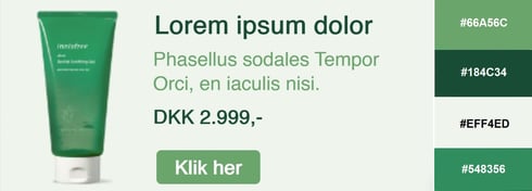
It might seem simple, but sticking to one color and its shades can make your product crystal clear to the user. By focusing on a single color, you’re also emphasizing a single value, which boosts the chances of your message resonating.
Explore the many shades of your product’s color and select the most eye-catching combination for a stylish banner. If your product features multiple colors, feel free to use them—as long as you stay within the same color spectrum to keep the design cohesive.
4. Mix Warm and Cold Colours
For those not fluent in design terms, the concepts of "warm" and "cold" colors might need some clarification.
It might seem odd to associate colors with temperatures, but it’s something we do intuitively. We link blue tones with cold because they remind us of snow and winter, while yellow and orange evoke warmth, often tied to summer and sunshine. That’s why summer sale banners often use these warm hues, while winter sales lean towards cooler colors.
Even though warm and cold colors are opposites, they can work beautifully together in a banner. Warm colors grab attention, while cool colors help communicate the message. When carefully balanced, this mix can create a banner that combines the best of both worlds.
5. Use Natural Banner Colours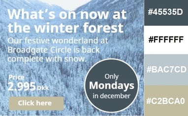
You do not need to do daily yoga or eat plant-based to make use of the colours of nature in your next banner. It is the usage of water and earth colours that can give your banner certain characteristics which the user will not forget. Banners using natural colours have also proven to have a calming effect on the perceiver. This does not mean that the user falls right to sleep when they view your banner, it simply means that they associate your brand with other values than if you would have used bright colours.
6. Using Red in Your Colour Combinations
Red is often linked with passion and romance, and you can use this to your advantage when selecting your banner colors. While we always encourage thinking outside the box, sometimes it’s smart to leverage these established associations too.
Of course, moderation is key. Red banners are common during Valentine’s Day and Christmas, but with a bit of creativity, yours won’t be just another holiday cliché.
Using red as the primary color doesn’t have to be predictable. Choose striking shades that complement each other, giving your banner a timeless and sophisticated feel.
Opposites attract — not just in romance, but in banner design too.
Using complementary colours can make your banner stand out and grab the user’s attention. This color pairing isn’t as common because many designers shy away from it, but with the right approach, these contrasting colours can create a striking and memorable banner.
Complementary colours come from the color wheel, where colours opposite each other evoke specific feelings. For example, in a travel agency banner, blue can symbolise cold skiing trips, while yellow suggests warm beach getaways. This combination ensures your message is both clear and visually balanced. And remember, blue and yellow aren’t just for IKEA! With this approach, your banner will make a lasting impression.
8. Make Your Banner Stand Out From the Crowd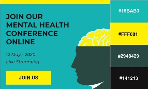
When making complementary colours such as yellow and blue the main colours of your banner, the outcomes can vary from our previous example if you decide to turn the colours’ brightness volume up a bit resulting in a more intense shade of the colours. Depending on brand and product, the decision of exactly how bright the colours should be can be adjusted.
Bright eye-catching colours do not have to be uncool, but we of course acknowledge the fact that they are referred to as more intense for a reason. You are guaranteed that they are the most eye catching colours when it comes to getting the attention of the users.
When choosing bright colours for your banner you have the option to steer clear off colours associated with neon lights or traffic cones.
Luckily a whole range of different bright colours exist, that can give your banner the cool brightness effect without making the perceiver nauseous. Browse through different colour libraries until you find a bright colour that is just right for your banner.
9. "Masculine" and "Feminine" Colours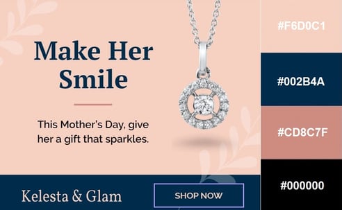
It is not like we want to go all politics on you or anything, we just want to underline the fact that there are no laws out there stating that banners advertising products meant for women, HAVE to be pink and full of flowers.
This goes both ways of course. If you are designing a banner, which aims to speak to the female segment of the population, there is nothing stopping you from combining pink colours with blue colours. When combining traditional masculine colours with traditional feminine colours on your banner we highly doubt that it will result in the user not being certain about if the product is meant for men or for women.
We have to face the fact that the world as a market is becoming more unisex, which means that there is no reason in limiting your banners to only aiming for half of the world.
Even if your product can exclusively be used by women, there is no harm in designing a banner which does not follow the traditional unwritten banner colour rules. Such a banner will only seem refreshing and innovative for the user. You can avoid using the obvious elements completely or you can combine colours across the spectra in order to create a sharp look.
Summary
There are a various of ways to proceed to when figuring out which are the most eye catching colour combinations for your next banner. Our examples should be perceived more as a source of inspiration rather than templates you should copy completely. Surely you can use exactly the colour codes displayed, but if you want to change one single colour or shade you should not limit yourself to our examples. By the end of the day, it comes down to what you think looks cool and which values you wish to convey through your banner.
With Zuuvi you can fast and effectively change the background colour, CTA-button colour and text colours when you build your banners.
Book a demo below to see if we're a match!