

A Complete Guide: HTML5 Banner Ads
It's that time of year again when the retail world goes into overdrive, preparing for the biggest shopping event of the year: Black Friday. However, in a sea of noise and fierce competition, how can you ensure that your Black Friday ads capture attention and remain authentic to your brand identity?
In this episode of “Anatomy of an Ad”, we’re analysing a Black Friday-themed display ad made by furniture company ILVA, published in November 2022. This display ad showcases how a company can combine its distinctive brand identity with the colour, messages and goals of a Black Friday campaign.
You can preview and play the ad in all its formats here.
Scroll down for the in-depth analysis!
- Overall Visual Impact
- Visual v. Goal
- Brand Identity
- Typography
- Shapes and Lines
- Layout
- Animation v. Responsiveness
- White Space
- Message
- Call to Action
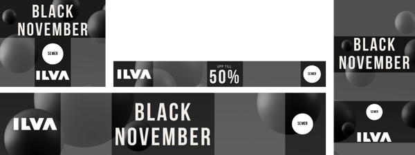
Overall Visual Impact
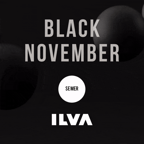
The ad has a very strong brand recall, despite its seasonality. Even without the logo, if you are familiar with the brand you can immediately recognise this ad as one coming from ILVA.
The ad communicates effectively ILVA’s brand characteristics, blending the seasonal colour and message with its CVI.
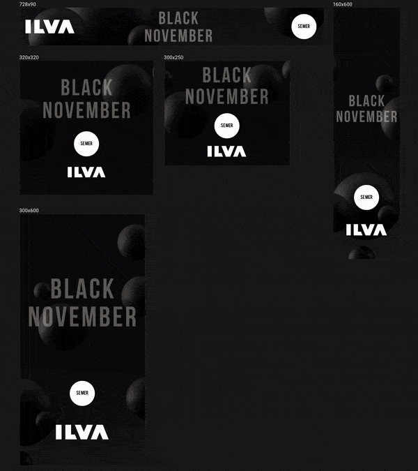
Furthermore, the ad cleverly makes use of its different formats to play with different animation styles and showcase its product from multiple perspectives.
Visual v. Goal
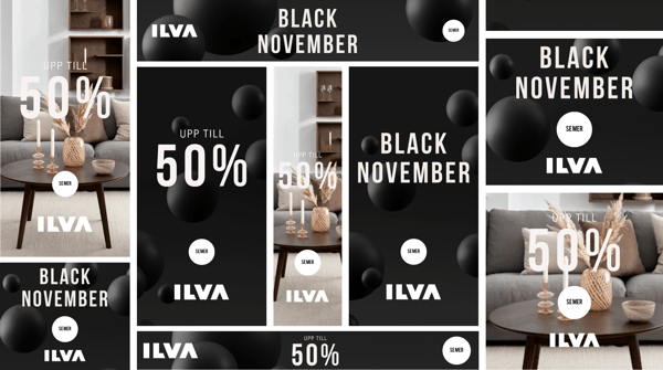
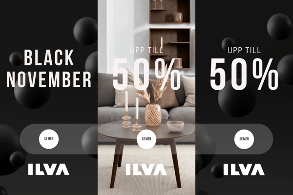
The goal of this ad across formats is to communicate price discounts on ILVA furniture during November and to encourage users to browse ILVA’s e-stores by clicking on the CTA.
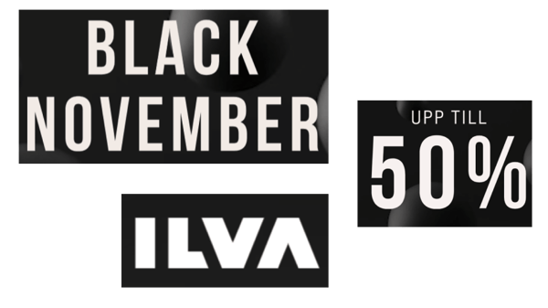
To achieve this goal, the ad leans on the use of the colour black to reinforce seasonality, and it showcases one of its products on sale, accompanied by the text “up to 50%” and the button “see more” to stimulate interaction.
Brand Identity
ILVA has managed to create a Black Friday ad that holds true and blends in with its brand identity.
ILVA's sharp, minimalistic logo and font are juxtaposed with round and soft shapes. The immediate visual association is to represent ILVA as a design, high-end, minimalistic, yet comfortable furniture manufacturer.
To that end, the use of black - usually associated with minimalism - and the contrast with the white font and logo further strengthen the association of ILVA with minimalism and design.
Typography
ILVA’s thin, sharp font further conveys its brand identity. Furthermore, the larger and bolder font on the discount rate is used to catch the eye of the reader and create a defined visual content hierarchy.
Shapes and Lines
ILVA’s round, bubbly shapes convey softness and comfort. Once again, its brand identity is mixed with the seasonality of the ad: ILVA’s characteristic blue and yellow bubbles are coloured in a thematic black or contrasting white.
%201.png?width=600&height=532&name=Frame%204%20(1)%201.png)
Furthermore, its shapes are an integral part of the ad, being used as transition elements or CTA containers.
Layout
In every ad format, you can find the same elements distributed in different layouts. On its vertical and square ad formats, ILVA wants to attract the attention of the viewer to the top of the ad.
Conversely, in its horizontal formats, the ad focus shifts to its centre.
Animation v. Responsiveness
Throughout the formats, all ads play out in the same sequence:
- An introduction sequence, including the headline “Black November”, the company logo, and the call to action.
- A bubble animation used a transition to showcase the main ad visual.
- A change of headline to “Up to 50%”.
- A different animation to either zoom or scroll on the visual, followed by an additional pulse animation of the CTA.
- A final transition to the original black background.
The ad makes clever use of its different formats and animations to showcase its visuals from different perspectives. For example, in vertical and square formats, the ad shows the product in a left-to-right scroll.
White Space
The use of white space changes with the different ad formats. There are different paddings from ad to ad. Furthermore, the size proportion between the headline, logo, and call to action is not consistent throughout the formats.
This leads to one case in particular, where the bigger logo and CTA distract the viewer from visualising the ad as intended.
Message
The ad message is clear and delivered in combination with the use of its visual: you can immediately understand it’s an up to 50% off deal on sofas, simply with the juxtaposition of the headline and the visual.
Furthermore, the tone of voice is consistent with ILVA’s stylish and high-end brand image. It deliberately opted not to use words like “deals”, “offers” or “discounts” as they would have cheapened the perception of its brand and products.
Call to Action
The call to action is visible and clear, albeit impersonal. It’s written in a seasonal black font and contained in a highly visible white button, which creates a stark contrast and helps the reader identify it. It indicates a follow-up to ILVA’s online store, rather than a specific product page.
Create HTML5 ads at scale
With so many people shopping online during the holiday season and so many products to shine a light on, you must be able to produce effective seasonal HTML5 ads at scale.
With Zuuvi, you can create HTML5 ads in minutes, across multiple banner formats, without writing a single line of code. You can learn more about HTML5 on Zuuvi here, or create one, completely for free, with the link below.


