
Creative Automation vs Creative Infrastructure: Scaling Global Brands
Disclaimer: you’ll probably be familiar with a lot of elements of this article. I mean, everyone knows what a headline or typography is. But are you making the most of your headlines? After all, it is one of the very first sentences your reader reads and can be decisive for the amount of traffic your content gets. If you feel like you have some aspects nailed down already, you can swiftly jump between different elements by clicking on the table of contents below.
Essential Digital Ad Components
Graphic Design Elements
Visual Impact
Best Practices of Display Advertising
Before diving in head first, let’s take one step back. What is the first goal if you're seeking success with display advertising? To capture the attention of your audience.
If you win their attention and rise above the ocean of sameness in the display ad world, you can make them stick around and see what you are offering.
When creating display ads, you can pick from an infinite amount of communication and visual elements. What to choose, why, and how, pretty much depends on the purpose of your ad: are you teasing a new product, running seasonal promotions, or promoting your brand?
Your ad mileage may vary based on that.
Here you'll get a handy list of key elements you should consider whenever you're working with display advertising.
The Essentials - Key Display Ads Components
Headline
A great headline instantly grabs your attention and communicates the main message of the ad. It should be short, and clear, and touch upon the key needs/pains of your audience.
Body
The body text should elaborate on the headline and visuals of a display ad, and provide more information about the product or service being advertised. It should be concise, easy to read, and use persuasive language to convince the viewer to take action.
Visuals
These would be the images you are using to hook your audience. They can range from product images and photographs to illustrations, charts, and logos. As a rule of thumb, in display advertising, visuals will make up the bulk of your ad.
You can use visuals to convey messages that may be hard to express through words, to showcase your brand, or to reinforce a written message.
Animation
Animation plays a vital role in display advertising as it enables creativity and helps achieve better performance. By incorporating movement, transitions, and effects into display ads, animation can effectively convey messages that may be difficult to express through words alone.
Additionally, animation can enhance the visual impact of an ad, drawing the viewer's attention to specific elements and guiding their focus towards the call to action. This in turn spurs a higher engagement and conversion rate.

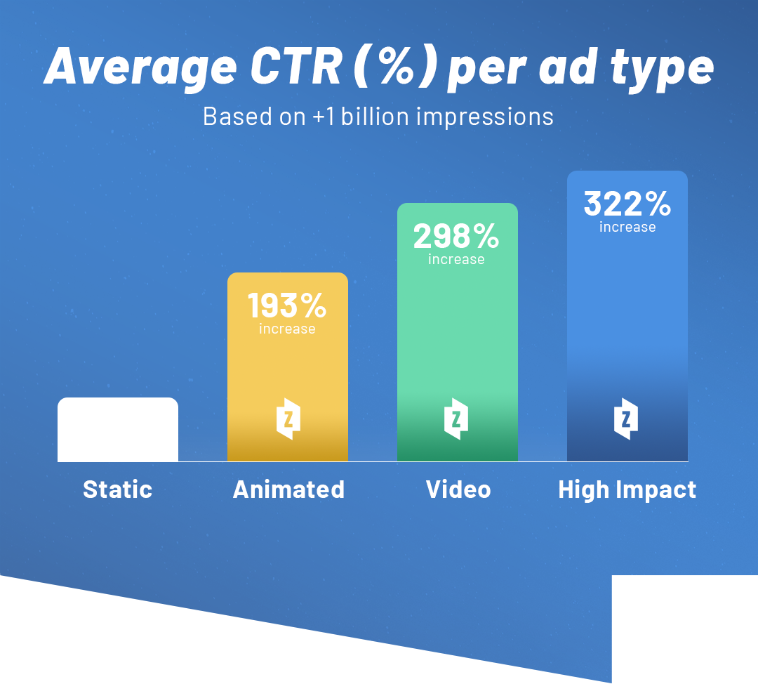
How much higher? According to over 1bn impressions we recorded, animated digital ads see a CTR increase of 300%.
Call-to-action
A strong call to action is essential to encourage the viewer to take action after seeing the display ad. It should be clear, and concise, and use action-oriented language to prompt the viewer to click, buy, or engage with the product or service.
Graphic Elements of Display Ads
Typography
Typography refers to how you display words to capture someone’s attention and communicate your message.
Typography impacts how your copy looks. Font types can give immediate impressions to your audience, regardless of the message you write. For example:
- A sharp, angular font conveys strength, straightforwardness and immediacy.
- A round, childish, font conveys approachability, cosiness, creativity
- Serif, thin fonts communicate elegance, stability, and tradition.
Lastly, font size immediately establishes a visual hierarchy in the mind of your audience. Looking at the previous Oister ad, the biggest-sized text is not the headline, but the price. The intent here was to use the price convenience ad as the main hook and to reinforce it with the headline next.
Colour Psychology
No subject is more important—or thornier—than the choice of colour for your display ads. Colour, hues, and tones will affect the whole mood of your ads or the whole digital campaign.
You can use different colours to impart a clear visual hierarchy to your ad copy. For example, one red word in a white body text will steer the attention of your reader.
The colour scheme you use will probably be limited by the brand's colours. Just like Coke will never release a display ad using Pepsi’s blue, you must learn the boundaries of your palette, and imagine your display ads accordingly.
Does this mean you should never deviate from your brand identity? Of course not! You can—and should—break from your traditional brand colours if you want to stir the right behavioural trigger in your audience. Think about seasonal campaigns: plenty of companies use the colour black for their Black Friday ads, red and green for Christmas, or pink for Valentine's Day. This can be super effective in the world of display advertising.
White Space
White space is the space surrounding your elements. Designers must pay attention to leaving too much or too little space between elements. In display ads, especially dynamic and video ads, designers can gradually fill or empty white space, to steer the eye of the reader to and from certain elements.
Visual Impact
Once all the elements of your display ad are in place, you need to take a step back and evaluate your work.
Visual Hierarchy
Is your display ad reading the way you intended it? What is the pattern you are drawing with your eyes? Visual hierarchy in digital ads is key to glueing
your audience to their screens.
So, do you break the scroll? How can you communicate the most relevant information in the span of a few seconds, without knowing for certain where your audience is going to look? While static ads must adapt visual hierarchy patterns in a single playfield, with dynamic and video ads, steering your audience attention’s is way easier.
By inserting an animation into the call to action or editing the elements of an ad, you can influence your audience's behaviour way more
effectively.
Need an example? Take a look at this ad from Randstad.
By gradually adding elements to your ad, you will be able to tell the message you want to tell, in the way you want.
A super simple, quickly designed way to make sure your ads are as easily understood as possible.
Try it out.
Brand Consistency
Is your display ad using the right brand colours, logos, and tone of voice? Keeping your ads consistent with your brand is essential in display advertising. This will help you build recognition and trust among your customers. Think of it as a little design seed in your audience's mind: sure, it won’t do much in the short run, but it’ll eventually sprout into memorable associations.
For reference, let’s look back at Oister’s ad: it might not mean much outside of Denmark, but Oister’s purple colour, white and yellow font, CGI purple oyster, and logo are immediately recognisable, regardless of the product advertised.
Responsiveness
Finally, a good design might work for an ad, but how do you translate that for many different formats, across different channels? You want to make sure you are not going to lose the effectiveness or beauty of your ad on a different format/channel.
TL;DR
Every day, we are bombarded with thousands of ads. As digital ads creators, our job to break the scroll and win over audiences has never been more challenging. While there is no secret recipe for a great digital ad, by identifying and mastering the key elements of an ad we can elevate our craft and create more wisely.
Excited to begin your journey to level up your performance in display advertising? Book a demo with Zuuvi and start now!


