What is Creative Freshness?
Learn more about online advertising ideas
Digital ads dominate a huge part of the online sphere and most of us definitely meet various banners throughout our daily interactions online. Even though digital ads are common, how successful their actual designs of them really are is debatable.
It can indeed be challenging to constantly think creatively and develop innovative banners in a continuous flow, whether or not you are new to the banner universe. So how do you manage to develop new, unique ads? We have gathered a number of good advertisement examples that you can use as inspiration for your further development of banners.
A well-chosen background has its value
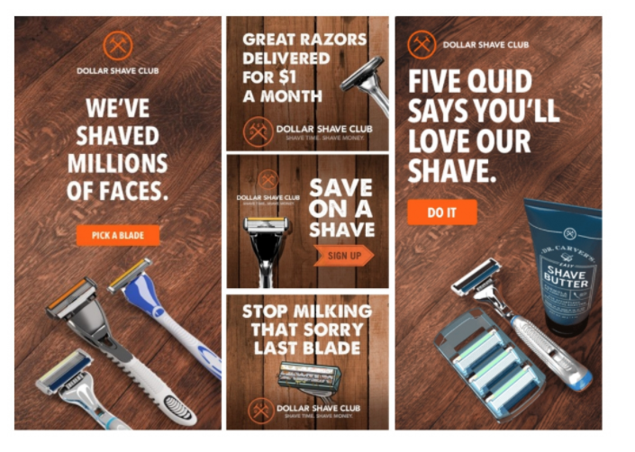
Spending a lot of effort on picking out which background your banner should feature may seem a like a small addition to the overall impression. More time may be devoted to creating the banner’s message and catchphrase rather than to the background. Nevertheless, if the selection of the background of an advertisement is done right, it can very well be the element that makes the difference. Put the perception that a background should always just be black or white to rest, and start thinking in creative ways that will result in unique ads. When designing your digital ad, you should stay up to date with the newest design trends and phenomena. For example is the rustic or vintage look very popular right now, which makes is an obvious choice when selecting your background, as seen in the example below. Choosing a background that represents an environment, color or material which is in balance with the general style your product or brand is trying to sell is indeed essential when it comes to creating creative advertising ideas. Are one of the characteristics of your product the fact that it is a lotion gentle on the skin? Then why not use silk or fine sand as a background on the banner to complement the value of the product? In other words, the background has to tell a story or contribute to the one your product already is trying to tell. As you see in the example below, the banner designer connects the razor product with a smooth wooden surface. This works great because it is visually pleasing while the background also highlights what the product does – Figuratively speaking of course. Watch and learn because this is how background selecting is done if you want an A+ business advertising idea.
Simplicity can be key
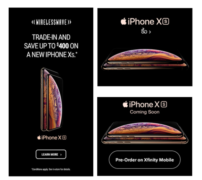
It may sound obvious and a bit boring, but banners designed with simplicity can actually turn out to be unique ads. There are a numerous amount of fonts, GIFs and animations out there that you can make use of when designing creative advertising ideas, although it is not always beneficial to overuse your instruments. Sometimes simple designs can be the most effective ones, especially if you are trying to convey a quick and straightforward message. Simple banners also have a tendency to be perceived as stylish. Therefore, consider carefully what kind of brand you wish to be perceived as through your ads, and make sure it is communicate properly through your banners. It is especially in terms of fonts and the actual visual content of the ad that you have the option of expressing yourself simplistically. The font Comic Sans has gradually become one of the most hated fonts that it has also unofficially been labeled as the most unprofessional and unpopular font. We are not mention this to demean Comic Sans but merely pointing out that fonts so have a huge influence on your design which means it is essential that you contemplate over which kind of font is suitable for your ad exactly. When aiming for the simplistic, it is at the same time important not to overfill the banner. Bright colors and animations all over the place is not necessary. Instead, you should choose a neutral background color, a candid photo of your product combined with a catchphrase that in a short and simple manner communicates your message to the users. If your product is of high quality and your catchphrase is compelling that should be more than enough for your banner to be exceptional, just using those elements. If you think that simple banner design is the way to go for you, we recommend bearing this saying in mind; If in doubt, leave it out. Take a look at this good advertisement example from Apple, who in some way are the experts of simple yet stylish banners.
Make use of testimonials
You might think that testimonials and reviews belong on Trustpilot or in the bottom of a company’s own website, but testimonials incorporated in online ads are actually a massive overlooked potential when it comes to creating creative advertising ideas. Because; what better way to speak directly to your potential new customers than to give the microphone to you current customers is there? When including testimonials you do not only underline that your product or service lives up to the expectations, but it will also have a bigger influence on the potential customers who see the banner. When developing business advertising ideas where testimonials are included, it is of course important to choose the right ones. Pick the most comprehensive testimonials out and those that reflect the customer experience you wish to deliver. Include the ones that are the most exceptional and that mediates in exactly which way your product or service has helped the customer. Here is an example of a unique ad from Clarisonic where the banners revolve around testimonials.

Be creative with imagery
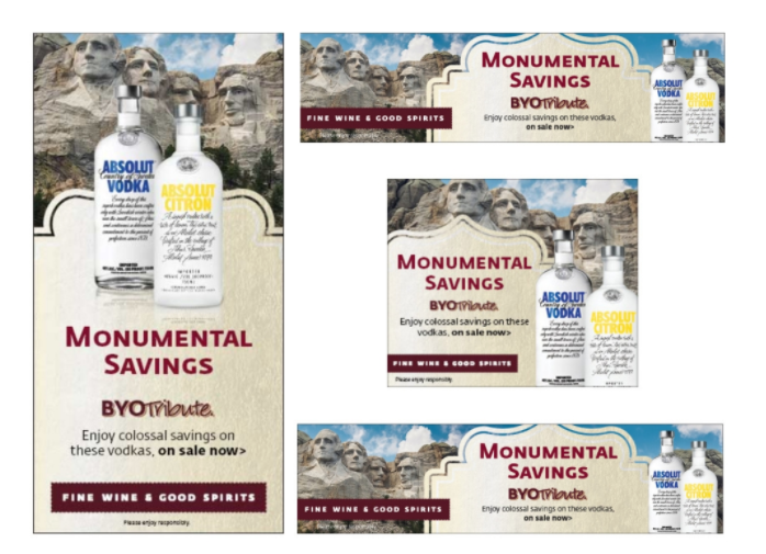
You probably already see it in many commercials. Companies say that they are “knocking down the prices” following visuals of a hammer that literally knocks down numbers. It may seem predictable and in many cases, that may be exactly what it takes. This way of using metaphors or imagery should not be limited to commercials only. It can also be used in banners by adding a dash of creativity. When doing so, it can be beneficial to make use of elements that create a figurative sense, rather than just incorporating obvious elements in your banner. The more time you spend on finding that element which suits your metaphor or figurative sense the most, the better your ad will perform. Take a look at this creative advertising idea from Absolut Vodka, where they advertise for “monumental” savings, which they underline by incorporating a background with actual monuments. Its humorous, it highlights their point and it is a reference that everyone will understand.
Speak to your niche
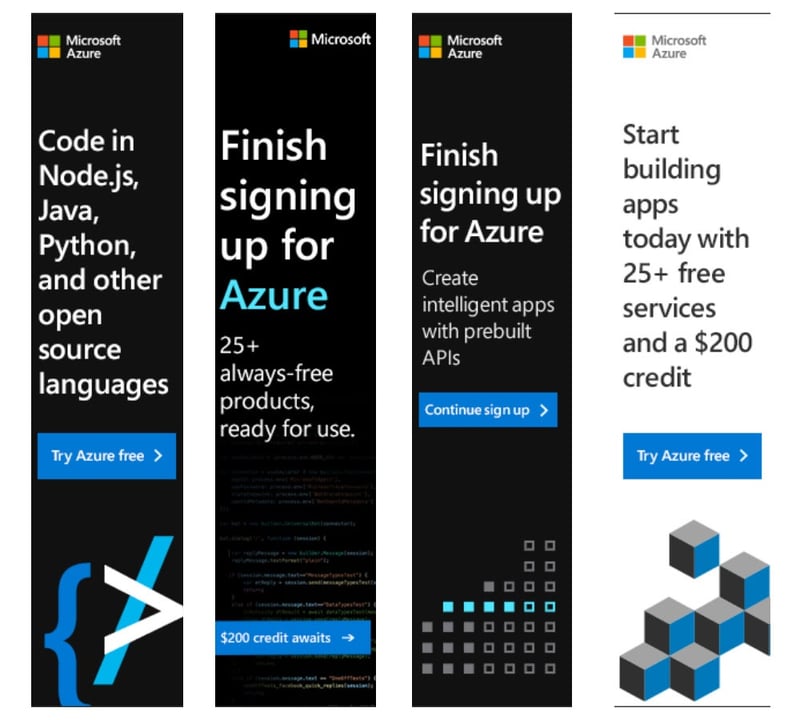
In the creation of great business advertising ideas, a lot of people attempt to reach a way too broad target audience. More often than not, it results in too general and impersonal ads that easily do not catch the interest of many. If your product or service is meant for people who fit into a niche segment, it can indeed be beneficial if your ads and their design also reflect exactly that. You can carry this out by including inside jokes, terms, issues or references. Are you trying to speak to the hardcore the Lord of the Rings fans? Why not include Elvish language on your banner, so the target audience have no doubt that the banner is meant for them? Look at how Microsoft speaks tech nerd on one of their digital banners.
Include illustrations and animations that are visually cool
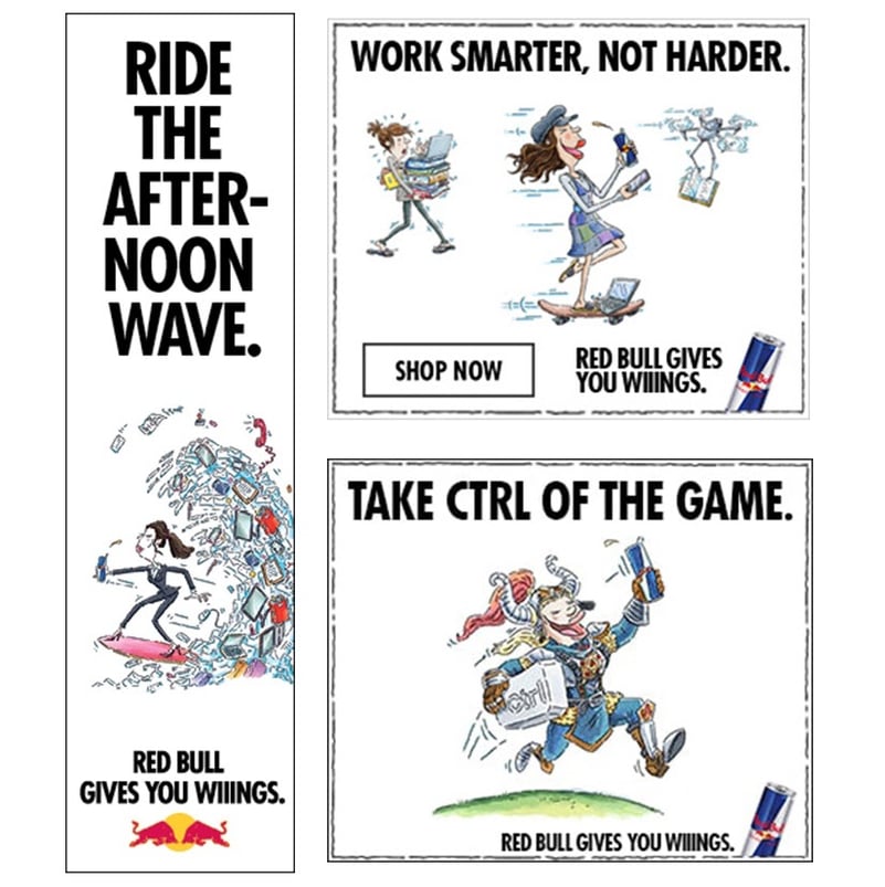
Cartoon characters are not only meant for children and childlike souls anymore. Including drawn or animated figures in your digital banners can actually be both creative and visually pleasing. If you product or service already is fresh and modern it will for sure be popular among the users, when you include cool illustrations in your ads. Because there is no limit, for what universe the illustrations or animations can take place in. Of course, Photoshop can edit humans into almost any environment, but the atmosphere when it comes to cartoon characters is simply just different. Although it is important to remember that there is no need to invest in the most advanced animations since drawn illustrations also has its charm. Take a look at this good advertisement example from Redbull, where illustrations are included in a great manner.
Are you interested in exploring how to capture attention and engage your target audience more effectively? Then animated banner ads might be the solution for you.
Be consistent with your design
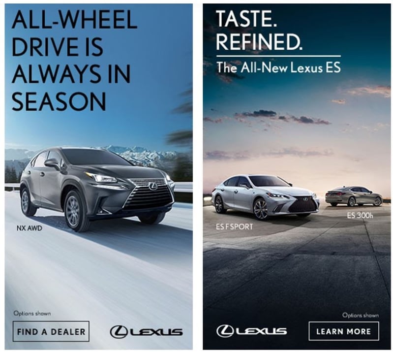
When developing your business advertising ideas and deciding on the banner design, it is crucial that a thread of consistency is visible throughout all of them. You should stick to one font and remain within the same color palette. To decide on one specific theme and stick with it, is essential in order for the user to create an understanding of that you as a brand have a persisting personality. This will also increase the recognition value and users will be able to associate your ads with one another. It creates brand awareness and makes your overall campaign seem more thought through. This example of banners from Lexus shows exactly how to keep consistent in the design, resulting in the user not having any doubt about the fact that these two separate banners are from the same brand. Take notice of how the significant long shadows appear every time a car is presented on a banner.
Show what your product is good for
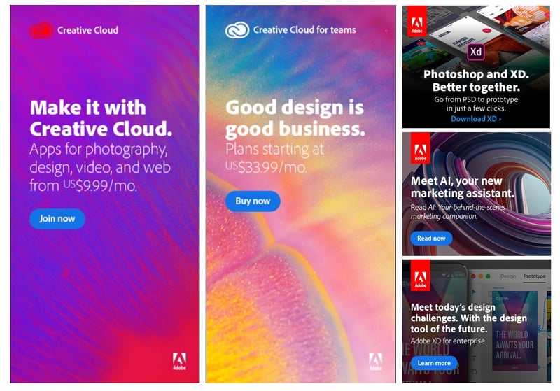
If the product or service you are advertising for is visually delightful in itself, displaying exactly that in the actual ads is a good idea. As mentioned, metaphors and other graphic instruments do have a special place in the heart of any designer, but wild animations and storylines are just not always necessary. Including examples of what you product can be used for, as well as examples of results you can achieve with it is can make unique ads since it also shows the user exactly what you are selling. There are a lot of cool banners and commercials out there, but some of them are simply too overdramatized that users are in doubt of what those cool ads are actually trying to sell. Turn the focus back on showing what your product can do and how it is best used.
Highlight elements that you know users are crazy about
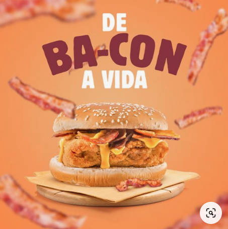
If you want to design a banner that reach a broad audience, an advice is to include elements or aspects of life that are widely appreciated. Bacon has somehow turned into some sort of cultural capital. The more, the merrier. The extra use of bacon in this good advertisement example below is thereby justified. But it is not only bacon that you can include in your ads. Use aspects of life that you know most people enjoy. Sleeping in. Sunshine. Or something completely different that you are aware of that your target audience loves. Of course, you are generalizing when doing so, but as long as you perceive your product being in harmony with the element that you are including, there is simply no harm in that. Take a look at this banner where there is enough bacon to go around.
With this introduction on how to create creative digital ads that are bound to be successful in mind, you will be well prepared to start developing your next top-notch banner. Choose Zuuvi and begin creating effective banner ads right away!
Tags:

10.12.2021


