What is Creative Freshness?
What impact do images have?
Most people within marketing know that it is a good idea to include an image when creating online content, but how important is it? We live in an age of visual culture where everyone owns a decent camera and carries it around in their pocket every day. When you combine that with the lowest attention spam ever, you get consumers who crave content that is easy to understand.
But just how important is it to include an image in your online advertising? Actually, recent studies claim that 67% of consumers say that it is VERY important when deciding to buy a product or interact with online marketing. As you see below, that is more than ratings and reviews- that previously (and maybe still) is the main focus of marketing.
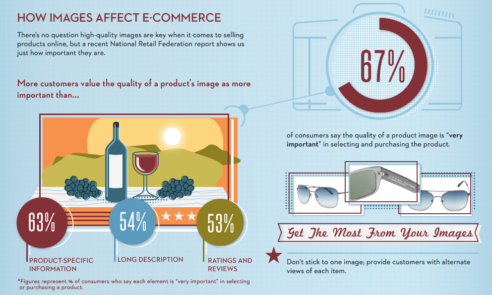
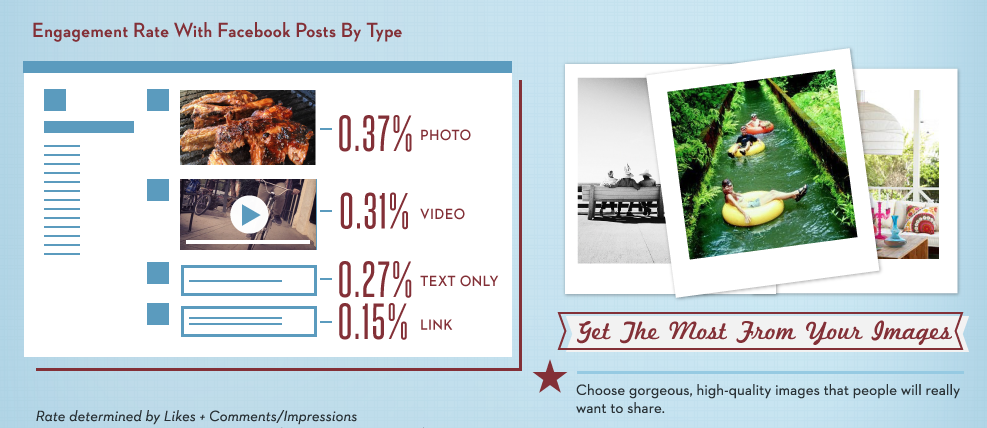
As you can see on the next infographic, the consumer is the most likely to engage with a Facebook post if it contains a photo or video.
And as you can see to the right, you should choose a high-quality image. If you want to know more about what image to choose, keep on reading!
What image should I use for my banner?
This is of course a tricky question. All roads leads to Rome but there are some simple guidelines that you need to follow when choosing your banner image.
Choose a high-quality image
You are selling a product that you are proud of. Show it! Don’t pick a blurry image, where the consumer has to guess what the message of the banner is. You increase your conversion of the image is high-quality and the consumer easy can see what the banner is selling.
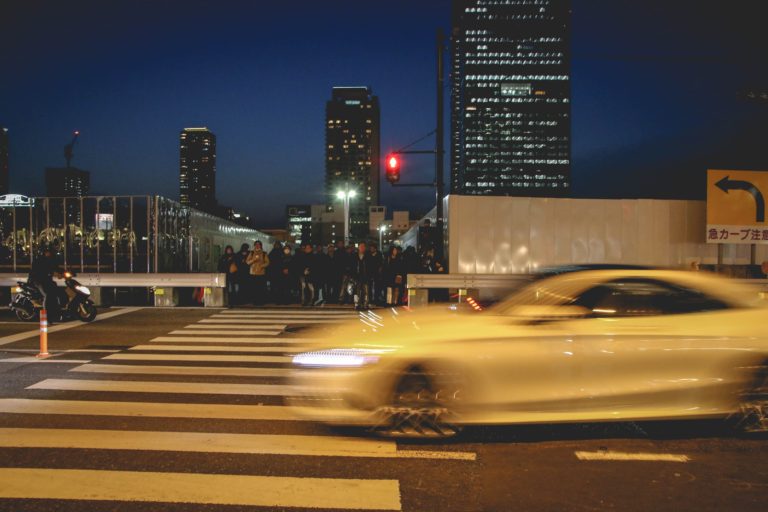
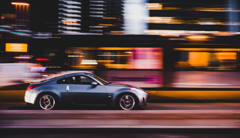
This might seem obvious, but sadly we see a lot of banners on the web, where it is very difficult to understand what the purpose is. When using a banner builder, remember to make your image fit the size of your banner. If it doesn’t it might become blurry.
Don’t have a physical product or not a professional picture? Don’t worry, there are plenty of ways to overcome this!
Where do I find an image for my banner?
So, now we know, that images are very important to increase conversion. And that you need to choose an image that displays your product in the very best way. But where do you find these if you do not have them? No worries – there are plenty of websites that offer pictures without royalty. You can find examples right here!
These websites offers you an endless stream of beautiful photos ready to be dropped into your banner builder.
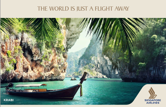
Find a picture that suits your message in your banner. This will definitely increase your click-through-rate – the more the picture relates to the text and the colors, the better the CTR.
A prime example is Singapore Airlines – a happy user of Zuuvi, is doing it just perfect in this case. The image is the eyecatcher and the text is in harmony with the message that Singapore Airlines wants to send. If you want to see more prime examples, check this page out!
The image tells a lot but not everything
Even though an image tells more than a thousand words – you still need some catchy text on your banner to really engage with your consumer and convert them into your Marketing Funnel. The CTA-button is also very important. If this sounds confusing – take a look at the Zuuvi Wisdom site or message us! We’ll be glad to help you!
Let’s get started!
Hopefully, you are a lot more confident with choosing the right banner image now. Feel free to try different images and different text. It’s easy with the Zuuvi banner builder. It allows you to change the photo in the platform and then instantly it will change on every site, that you have posted your banner. We believe in performance and testing your results – this is why we have made it so easy to split-test all your banners.
Tags:

10.12.2021


