A Complete Guide: HTML5 Banner Ads
When I wake up in the morning, normally the first thing I do is pick up my phone. Sometimes I’m productive - I swiftly turn off the alarm and prepare to seize the day. On 6 out of 7 days in the week, however, I procrastinate by reading articles, scrolling social media, or checking how much it’s going to rain today (Yep, that’s life in Denmark for you).
Surely, I scroll past several banner ads, but I wouldn’t be able to tell you which ones. This is because my cyber-trained eye quickly filters out generic-looking ads. Your eyes do the same and so do your customers’. As ad-creators, knowing how to avoid this, is essential.
In this article, we’ll take a look at what banner blindness is, why it happens, and even give you some tips and tricks on how to make sure your ad steers clear.
- What is Banner Blindness?
- What Causes Banner Blindness?
- The Impact of Banner Blindness on Your Campaigns
- Strategies to Overcome Banner Blindness
What is Banner Blindness?
Banner blindness is a phenomenon where online users consciously or unconsciously ignore information that is placed in banner ads, content that looks like banner ads, or places where banners are typically found. Banner blindness is also referred to as ad blindness or banner noise. This can occur even when the banner contains information visitors are actively seeking.
Why does banner blindness matter? Because if display ads have a Click-Through Rate lower than 1%, banner blindness is one of, if not the main reason.
When was banner blindness first discovered?
Banner blindness is as old as the Internet itself: psychologist Jan Panero Benway put banner blindness on the map with a research paper in 1998. In his paper, Benway found that users tended to ignore not just traditional banner ads but also any content that was perceived to be ads, including text or images styled in a way that resembled ads.
However, banner blindness reached the attention of the wider marketing audience when Jakob Nielsen and Kara Pernice at Nielsen Norman Group conducted an eye-tracking study in 2007. The study showed us exactly what was getting the viewers' attention, but more importantly, what was not.
The outcome? This study cemented Benway's research: viewers completely overlooked those areas where they expected to find banner ads or other ad-like content. But it did more than that. It showed us that even when banners were integrated with the content space on web pages, users still overlooked them. This indicated a learned behaviour of avoiding areas, designs, or formats they assumed contained ads.
Is there a difference between banner blindness and ad fatigue?
While some people use banner blindness and ad fatigue interchangeably, and the two terms are quite closely related, they do not mean the same. Ad fatigue occurs when your audience becomes less responsive to your ads after having seen them for a long time. This usually leads to your audience selectively ignoring your ads (a.k.a. banner blindness). So, banner blindness might be a side effect of ad fatigue, but solving it can require a lot more thought.
What Causes Banner Blindness?
Triggers of Learned Behaviours
For a long time, ad creators leaned on research stating that to make sure ads really attract attention, bright makes right. Ads had to be bright, bombastic, and so outstanding you could not miss them from 100 miles away. And this was great...at first. Ads caught the attention of all viewers and made them read. However, it also taught them how to spot these attention triggers, label them as ads or ad-like content, and tune them out from their field of vision.
Let's circle back to what I said about my cyber-trained eye - it's actually a learned behaviour.
My brain immediately recognises aggressively coloured ad-like content (such as the examples below), and if it's in a typical banner format, I will immediately skip it, making sure it receives 0% of my attention.

This is backed up by research. A recent study showed that viewers block out commonly used attention triggers, leaving the generically flashy ads much less impactful than previously.
Ad Placement
Whether or not banner blindness occurs also depends on the placement of your ads. Placing them exactly where the viewers expect them to be is something you should try to avoid. Take a look at the example below:
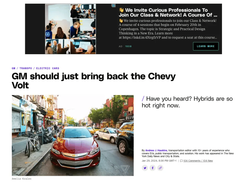
Immediately, I know the banner above the title is going to be a prime location for promotional content. And as a result, my first action after I land on the article is to scroll down and go straight to the content I want to read. And while this is a pretty apparent example, the same applies to ads placed on the sidebars or the footer. This calls for creativity - placing ads in new spaces that draw the viewers' attention can be a real game-changer.
Predictable Layouts
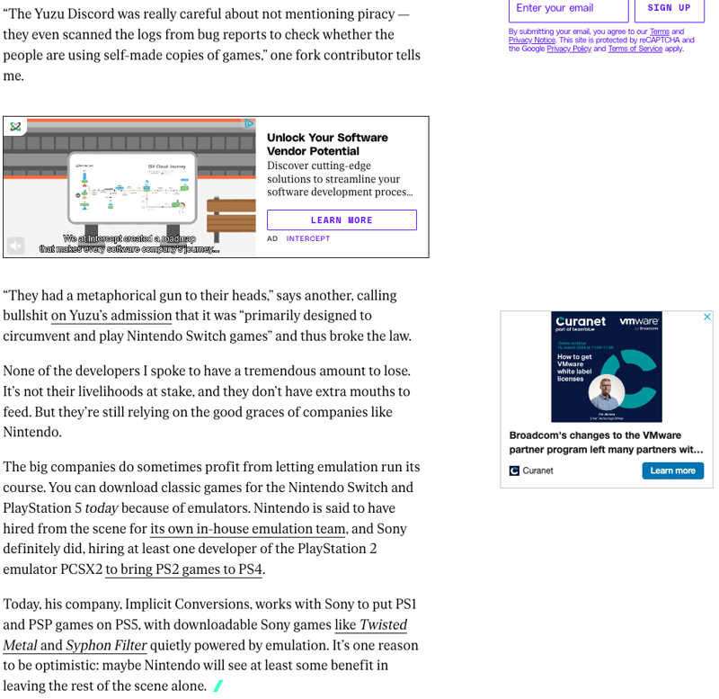
Going back to the triggers of learned behaviours: if you picture an online banner, you probably have a pretty clear idea of how it can look. This is because ads have quite predictable layouts, copy elements, or colour schemes. Whenever you see a sudden dash of colour in a sea of white, a sensationalistic headline mixed with a big and flashy product in the foreground, you know what you're looking at...and you're immediately going to skip it.
Ad Clutter
When viewers see everything at once, really they see nothing at all.
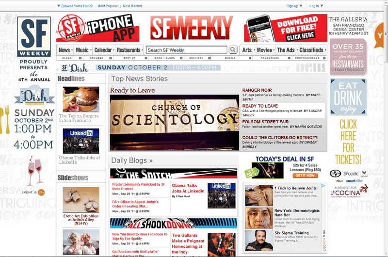
Banner blindness is not only due to boring-looking ads. When looking at a website where ads are clearly cluttering the site with content, users are unable to take in the information provided. This is often the case with ads that look very different from the rest of the site they appear on.
This is an issue since the hard work you put into your ads becomes worthless.
Oof.
Don't worry - we'll get to how to avoid that in just a moment.
Navigation Interference
We've all been there: is it 6 or 7 minutes in the water for a soft-boiled egg? Should the rice be added before or after the water boils?
In search of help, a quick Google search takes you to a website, but suddenly pop-ups, take-over ads and calls for you to subscribe to newsletters and promising 10% discounts as rewards demand your full attention.
This triggers two immediate actions in your audience: they either actively try to skip your ads to get to the content they need, or they flee the intrusive site in droves to find this very simple information elsewhere. In both cases, you've antagonised your audience, making them aware of you...for all the wrong reasons.

What I'm trying to tell you is that interfering with users' navigation can be a huge no-go. It's frustrating and pushy.
Pushing your message or ad intrusively in your viewers' faces does not counter banner blindness, even though it may seem like a literal "cure". Rather, it will make the user ignore or shut your pop-ups without thinking twice.
How Does Banner Blindness Impact Your Marketing Performance?
Ads being ignored isn't only unfortunate because of the lack of attention it gets. The lack of attention translates into your marketing KPIs going in the red.
But let's take a closer look at how banner blindness impacts your campaign performance.
Lower Performance
With more ads cluttering the online space and users becoming more expert at filtering them out, your CTR is going to be the first metric to suffer. The average click-through rate for display ads is already less than 1%, which is not great. And according to our most recent data, traditional display ads perform even worse, with CTR as low as 0.5%!
Wasted ad spend
Since more advertisers rely on display advertising for their online campaigns, the demand for digital real estate has surged. Consequently, publishing your ads has never cost more. Add to that the fact that clicks are plummeting, and it's no wonder that your CPCs are ballooning.
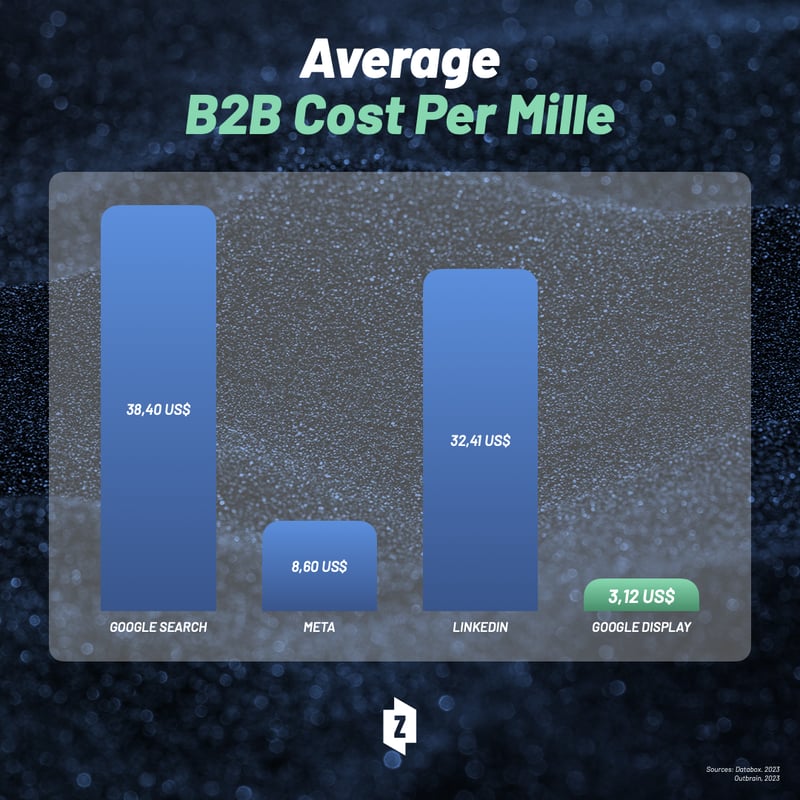
And while your CPM is still way below traditional advertising channels like paid social or paid search, if your strategy solely relies on display ads, you are throwing a lot of money out the window you could spend more effectively elsewhere.
Negative Brand Perception
A significant implication of banner blindness is that when customers ignore your banner ads, it can affect your brand perception negatively. No one wants to be the brand, whose ads the customers ignore over and over again. Worse still, no one wants to be the brand, whose ads the customers recognise as persistent or irritating, and have their brand reputation ruined.
This is one of the best reasons to take banner blindness seriously and make sure it does not happen on your watch.
Strategies to Overcome Banner Blindness
Like a seasoned doctor, you should now be able to diagnose banner blindness in a heartbeat. Now, what can you do to cure your campaigns from it? Unlike ad fatigue, banner blindness requires you to apply many different techniques, depending on the nature of your ads, your targeting expertise, and most importantly, your creativity. Here are some of my suggestions.
1. Place ads on the content organically
Integrating ads within the content flow can significantly reduce banner blindness. Mentioning this article once again, one of the suggested solutions is to design ads that mimic the appearance and feel of the content surrounding them. By camouflaging your ads like a marketing chameleon, you can make them less intrusive to your users, meaning they will be more inclined to read them. And if the ad is relevant and personalised to the user, your performance is going to skyrocket. For instance, a blog post about hiking routes in Denmark could organically feature ads for hiking gear or, if you are outside of Denmark, an ad redirecting to an airline company. These ads blend into the article’s context, making it more likely for users to notice and interact with them.
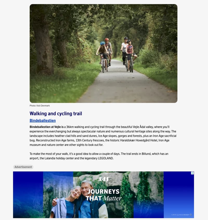
The key is subtlety and relevance, creating a seamless experience for the user where the ad complements the content, rather than disrupting it.
2. Experiment with different ad formats and placements
Standard banner ads often go unnoticed due to their predictability. To combat this, experimenting with various ad formats and unconventional placements can capture user attention. Interactive ads, video ads, or immersive 360-degree ad experiences invite user engagement and can significantly stand out. Additionally, placing ads in unexpected locations, such as within the comments section of a site or embedded in interactive content, can surprise users and draw their attention.
Take a look at this ad by McDonalds below. Yes, I know; it's not a digital banner ad. However, the concept of creative ad placement is the same.
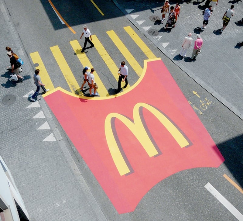
One of the reasons why this advertisement got the traction and attention it did, is because of it having a super unique format and placement, that requires our brains to pay attention to it and make sense of it.
Also, it's preeetty clever.
3. Use personalisation and contextual targeting
The one-size-fits-all approach to advertising is a surefire way to increase banner blindness. Personalisation and targeting, powered by first-party data or contextual insights, ensure that ads displayed are tailored to the interests, behaviours, and current needs of the user. Dynamic Creative Optimization (DCO) plays a pivotal role here by adjusting the creative elements of ads in real-time based on user data, significantly enhancing relevance and engagement.

Whether it's by showcasing products similar to what the user has viewed before or by adapting the messaging based on the user's location, personalised ads are more likely to catch the user's eye and resonate on a personal level.
4. Use interactive and high-impact advertising
Once again, it's important to emphasise how the research mentioned earlier points to creativity. Re-think the traditional ways of ad composition.
Don't get me wrong; there are definitely key elements you need to include in your digital ad - which we covered in this article - but there are a million ways to do so.
For example, interactive ads that require user engagement, such as sticky ads or interactive videos, combat banner blindness by involving the user directly in the ad experience. These formats can transform passive observers into active participants, thereby increasing the likelihood of ad recall and engagement.
High-impact advertising strategies that leverage bold visuals, engaging animations, or compelling narratives can also make an ad more noticeable. By designing ads that are visually striking or tell a compelling story (and that do not obstruct the user viewability of the page), marketers can capture users' attention more effectively. The use of motion in ads, such as subtle animations or video backgrounds, can further enhance visibility and draw the user's eye towards the ad.
Instead of following a checklist or replicating your competitors' composition choices, be inspired by what works well and then find ways to make your ads look unique.
Excited to begin your journey to level up your performance on advertisements? Book a demo today, and let a Zuuvineer demonstrate our platform.
TL;DR
We often begin our days immersed in a sea of content and ads, many of which fail to capture our attention due to "banner blindness."
Banner blindness, the phenomenon where users ignore online ads, poses a challenge for advertisers and their revenue. This is caused by predictable layouts, expected ad locations, and clutter, which can reduce ad effectiveness and harm brand perception.
To counteract this, it's vital to blend ads into content, use diverse ad formats and placements, and start adopting more refined forms of advertising, such as dynamic content, contextual targeting and high-impact ads. These can improve visibility and engagement, helping advertisers overcome banner blindness and connect with their audience.
Tags:
14.3.2024


